... Well, I wake in the morning,
Fold my hands and pray for rain.
I got a head full of ideas
That are drivin' me insane.
It's a shame the way she makes me scrub the floor.
I ain't gonna work on Maggie's farm no more.
Bob Dylan
Years ago, when I did system programming on IBM mainframe computers (back when dinosaurs roamed the earth), I was introduced to a very thorough, cost-effective, and tedious process for updating what we affectionately called the System 370 POO (or Principles of Operation). IBM would send out new pages to the user and let them do the manual labor. It often took a half an hour of opening and closing my 3-ring binders, adding, deleting, and inserting pages. I felt like I was providing free labor to IBM.
Every time updates arrive for my Jeppesen instrument approach procedures, I feel the same sense of dread. Now I use both Jepp charts and NACO charts and I find the NACO product to be painless - just buy an new bound volume every 56 days and throw the old one in the recycle bin. No fuss, no muss. Since I still teach pilots who prefer Jepp charts, I need to use them too.
I'm sure Jeppesen would love to get out of the paper chart business. It's incredibly labor intensive and tedious to prepare all those updates and most of the work is done by hand. Imagine a work environment straight out of Herman Melville's Bartleby the Scrivener and you get the idea. In fact, when my Jepp updates arrive, I often quote Bartleby to myself: "I would prefer not to." This instrument procedure update process is definitely a good job for a computer. Granted, the CMax system on the new Cirrus aircraft and others provides the pilots with electronic version of Jepp charts, what about the rest of us who rent planes and move from aircraft to aircraft?
Over the past few days, I've been fortunate to test drive the new eFlyBook, an electronic system for displaying FAA terminal procedures. Let me say first off that I'm very impressed with this unit. Even with it's current flaws I think eFlyBook is very useful and has tremendous potential. Imagine a device the size and weight of your average kneeboard that contains all the terminal procedures, high- and low-altitude enroute charts, and the AFD for the entire U.S., including Alaska, Hawaii, Puerto Rico, and the Virgin Islands. And imagine updates to these charts being done electronically.
The eFlyBook is an application that runs on the iRex iLiad reader. The iLiad reader is the brain child of iRex Technologies BV, a spin-off from Royal Philips Electronics. The eFlyBook application that runs on the iLiad reader is produced by ARINC and marketed by MyAirplane. The result is a promising, very basic sort of electronic flight bag, although I'm uncertain what the actual status of the unit is with regard to the FAA EFB classification system. The unit is currently selling at a discount for about $1200, including the first year's chart subscription and all updates, but the list price will probably increase to $1500 in the near future. Annual subscription renewal is about $250, which is very competitive considering what that buys you.
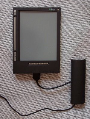
My cursory research revealed that the iLiad reader seems to be using a Linux-variant core operating system running on an 400MHz Intel X-Scale Processor with just 64MB Ram. Additional storage is provided through USB memory sticks, a CF type II slot, and an SD card. The core operating system apparently has no multi-tasking capability or support for threads. This makes the reader simple and it also creates some annoying limitations. More on this later. The unit provides a 10BaseT ethernet connection as well as 802.11g wireless LAN support, but understand this is not a tablet PC. It is a device for display electronic documents so it doesn't provide general purpose features like a web browser or text editing in the conventional sense. The network connections are there to provide a seamless way to update the content stored on the reader. The USB and ethernet hardwire connections are provided on the AC power supply, shown attached in the above photograph. It's a cumbersome arrangement, but luckily one that you don't need to use in the cockpit.
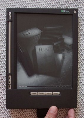
You power up by holding a small slider switch at the bottom right edge of the iLiad reader for a couple of seconds. A progress bar at the bottom indicates the unit is working and my tests indicate that the power-up sequence takes about 50 seconds. The batteries are advertised to last for many hours, but I've found they get low in about 3 hours if you are displaying and changing pages a lot. The iLiad form factor is comfortable and the weight is very reasonable - about 14 ounces (390 grams) - especially when you consider all the stuff stored in this unit. In addition to all the terminal procedures it also contains relevant sections of the so-called FARs - Title 14 of the Code of Federal Regulations.
Unfortunately, there are some limitations. The AF/D is yet to be released and the enroute charts are pretty much unusable in their current state - too hard to display, pan, and zoom, though the developers are working on fixes for all this. The AIM is also of limited use in its current state since it has no index and no way to jump to a specific chapter. Still, for the weight and rough size of one bound volume of NACO approach plates, you get IAPs for the whole country.
After the unit powers up, you'll see a configuration screen. To get to the eFlyBook application, which contains all the aviation goodies, just press the DOCS button at the bottom of the display.
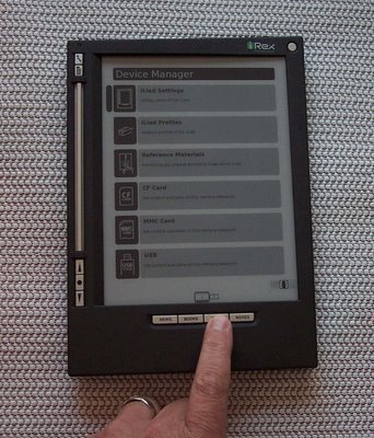
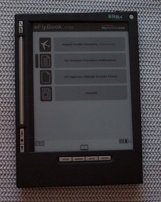
You can use the Previous, Confirm, and Next keys on the lower left to select some features, but for some things you'll need to use the stylus (stored in the back of the unit). You can't just tap on the screen with your finger or a pen; you must use the stylus in some situations. Above these buttons is a long Flipbar you use as though you were turning pages in a real book, but again, the user interface policy for the use of most of these buttons is not consistent - something the developers have promised to correct in a soon-to-be-released update. In the meantime, there needs to be a way to tether the stylus to the unit so it doesn't get lost during flight.

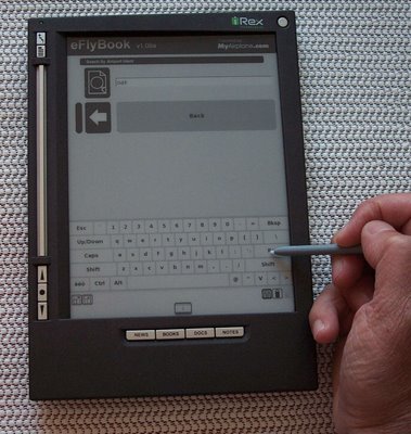
Once you have selected Terminal Procedures, a search page appears with a QWERTY keyboard you can tap on with the stylus. The search feature needs to be fleshed out since as it stands now, you need to know the 3-character identifier of the airport whose procedures you wish to display. What is needed is the same features provided in the NACO web site search page. Namely to be able to search by state, city, or airport identifier. There is also potential for a recently used list of airport IDs as well as a flight folder where you could store procedures for your departure, destination, and alternate. As it stands now, you must use the stylus to enter the airport ID and for almost all input while accessing a particular airport's procedures, but the developers are promising an update to allow you to display a procedure without using the stylus.
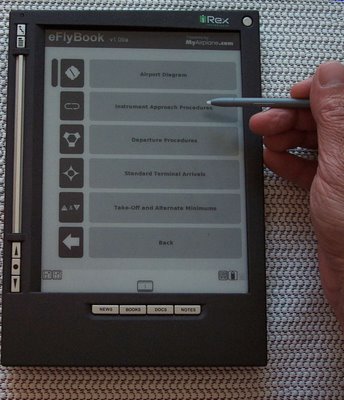
Once you have selected an airport, a list of procedures is displayed, but the name of the airport is not displayed on this list! Imagine getting to this page, getting interrupted, and then looking back at this page and wondering "Now what the hell was I doing?" Another annoyance is that if you tap on the STARs or DPs and there are no such procedures for the selected airport, you don't really get any feedback; the unit just accepts your stylus tap and ignores it. This can make you wonder if your input was even detected and leads to frustration.
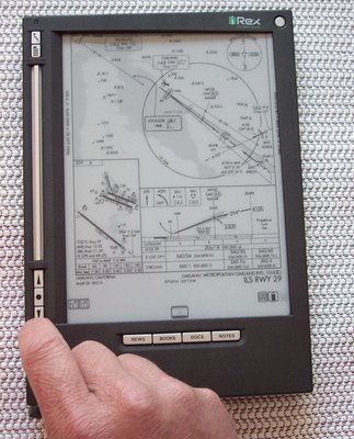
From a list of procedures (not shown), you use the stylus to select the one you want to display. Here is the OAK ILS 29 approach and notice that the entire procedure cannot be displayed at once. This is not as bad as it seems. You display the top half, complete your approach briefing, then use the Next key to display the plan and profile view. The quality of the display is excellent, much better than the NACO charts printed on that crappy paper they use. The display uses a technology called electronic ink and it looks just like a black-and-white image printed on paper. The display has no backlighting, so you need some sort of ambient light to read the display - just like paper.

Some SIDs and STARs are multi-page affairs and the eFlyBook doesn't handle them very well. You'd think it would treat a multi-page procedure as one document and let you use the Flipbar to page back and forth, but that's not the way it's currently implemented. Each page is a separate document and you must back out of one before you can select the other page to display. Hopefully a fix is in the offing because the way it currently works is just dumb, dumb, dumb.
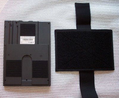
Some SIDs and STARs are printed in landscape format and the way you handle those procedures is to physically remove the iLiad reader from the kneeboard (it's attached with velcro) and physically rotate it to a landscape orientation. Not terribly elegant, but it works.
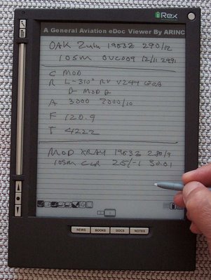
Press the NOTES button and you can write on a notepad or flight plan form. Here I've recorded the ATIS and clearance, then the ATIS for my destination. Pretty cool, but here's the bad news. Since the core OS doesn't support threaded operations, you can't just swap back and forth between displaying a procedure and taking notes. One proposed solution is to provide a PDF display on which you can draw. Not sure if this really solves the problem since most procedures have scant white space on which to doodle, but it would be better than the current arrangement.
All in all, this is a pretty slick unit with loads of potential. The developers seem attentive to feature requests and there are regular updates. Best of all, an electronic chart update procedure is something all pilots need and deserve.


